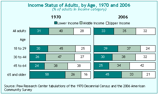
Since 1970, the middle income tier in America has shrunk by about 5 percentage points.7
In 1970, 40% of all adults in this country lived in a middle income household, with “middle” defined as one where the income falls within 75% to 150% of the median. By 2006, just 35% of adults were in the middle income tier. This small but notable hollowing out of the middle has been accompanied by an increase in the share of adults in both the lower income category and the upper income category. The rise in share has been greater over this time period for the upper group (to 32% in 2006 from 28% in 1970) than for the lower income tier (to 33% in 2006 from 31% in 1970). Looking at these changes by age group shows that the trends have been very different for the youngest and oldest adults. The 65 and older group has moved ahead during the past 36 years; the 18-to-29 year old group has fallen behind. Among the older group, just 45% were in the lower income tier in 2006, down from 58% in 1970. Among the younger group, 39% were lower income in 2006, up from 30% in 1970.
Some demographic groups have improved their income status since 1970; others have fallen behind.
The period since 1970 has seen a distinct sorting of many different demographic groups into different income tiers. In addition to the elderly, the groups that have gained the most include blacks and native-born Hispanics. Married adults have also done well, while the never-married have fallen behind. On the gender front, men and women have moved in different directions, depending on marital and work status. Working husbands and working wives both have seen their income positions improve since 1970, but the gains have been greater for working husbands. Among those who are not married, the gender pattern is reversed: single working women’s income position has improved since 1970, while single working men’s income position has declined. Other groups that have not fared well are young adults, people in lower-skilled jobs, people with less educational attainment, and immigrant Hispanics. The decline for this last group is mainly the result of a heavy influx of low-skilled immigrants, rather than downward mobility among immigrants already in the U.S.
Since 1970, the middle income tier has gotten older, better educated, less likely to be white and less likely to be married.
<a class=”null” title=”Demographic Characteristics of Middle Inco me Adults, 1970 and 2006″ href=”https://www.pewresearch.org/social-trends/2008/04/09/inside-the-middle-class-bad-times-hit-the-good-life/529-2/” target=”_blank”>Demographic changes in the middle income tier since 1970 are very similar to the changes in theU.S. adult population as a whole. The average age for middle income adults was 45 in 2006, up from 41 in 1970 (comparable figures for the full adult population are 46 in 2006 and 44 in 1970). In 1970, 88% of the middle income group was white; by 2006, just 71% was white (comparable figures for the full adult population are 86% in 1970 and 70% in 2006). The ethnic group that moved heavily into the middle income tier during this period was Hispanics: In 1970, they made up just 3% of the middle tier; by 2006, they were 13%. In 1970, more than three-quarters (76%) of the middle income group were married; by 2006, just 57% were married. But the biggest demographic change has come in levels of educational attainment. In 1970, just one-in-five middle income adults had at least some college education; by 2006, more than half did. As noted on the previous page, never married adults and those with less educational attainment have been among the groups suffering the biggest losses in income status over this period.

Since 1969, median household income has risen for all Americans. But it has not risen as much for the middle income group as for the lower and upper income groups.
From 1969 through 2006, median annual household income increased by 41%, after adjusting for the decline in household size.8 However, the rise was greater for the upper income tier (50%) than for the middle (40%) or lower (42%) tier. By 2006, the median income of the upper group was $128,040, about double the $63,955 median income of the middle group and about five times the $25,201 median income of the lower group. This long-term increase in income inequality is more pronounced when one focuses on the top 1%, 5% or 10% of U.S. households. Each of these high-end groups has pulled farther away from the group just below it.9
The growth in median family income has been slower and more skewed to upper income groups since 1973 than it had been in earlier decades.
When looking at changes over time in the standard of living of the American public, economists often divide the past six decades into two eras. The period from 1947-73 was characterized by robust average annual increases for all income tiers, as well as a modest decline in income inequality. The period since 1973 has been characterized by much slower growth for all groups, and also by an increase in income inequality.In the first era, the average annual growth rate in family income exceeded 2.5% in all income quintiles– and the growth was slightly higher in the lower quintiles than in the upper quintiles. In the second era, the average annual growth rate was much lower for all quintiles, but it was much higher in the upper quintiles than in the lower quintiles.
Since 1999, all income groups have seen their real incomes decline.
Since hitting a peak in 1999, median household income has declined for all three income groups. On a percentage basis, the decline from 1999 to 2006 has been slightly greater for the lower income group (5%) than for the middle income group (3%) or the upper income group (2%). This is one of the longest periods in modern history in which this key economic indicator has not returned to an earlier peak– although the trend in recent decades has been toward protracted but shallow declines following periods of growth. Should the economy fall into a new recession– as many economists now predict– the current downturn would become the longest in modern history.

Median family wealth has grown in recent decades. The biggest gains by far have been made by those in upper income groups.
The median net worth of families (all assets minus all debt) has risen by 50% over the past two decades, from $69,902 in 1983 to $104,645 in 2004 (all figures inflation-adjusted to 2008 dollars). But this growth has been spread unevenly through the income tiers. For the top income group, median family wealth has more than doubled during this time period, rising by 123% to $439,390 in 2004. For the middle income group, median wealth increased by only 29%, rising to $98,286 in 2004. For the lower income group, median wealth increased by just 24%, rising to $16,000 in 2004.
As Americans have seen the values of their homes rise over the past two decades, they have increased the size of their debt. This is especially true for those in the middle income group.
In every way that can be measured– size, value, source of wealth, collateral for debt— the American home bulks larger than ever in the economic life of the middle class (and the nation as whole). A new single-family home is about 50% bigger today than a new home was a generation ago. The median sales price of existing single-family homes has risen in inflation-adjusted dollars from $142,578 in 1983 to $223,362 in 2007.10 However, while homeowners have seen the value of their biggest asset rise sharply, they have also leveraged their homes to take out ever more debt. This is especially true for middle income families, whose overall debt-to-asset ratio rose from .25 in 1983 to .40 in 2004. Their increase in debt burden was much greater than that of the upper income group (it rose from 0.21 in 1983 to 0.27 in 2004) and slightly greater than that of the lower income group (for whom it rose from 0.29 in 1983 to 0.42 in 2004). For middle income families, 78% of their increase in debt between 1983 and 2004 was due to debt secured by their primary residence.
Since 1980, expenditure levels have risen for all three income tiers, but they have risen the most for the upper tier. Families in all tiers have changed the mix of where they spend their money.
As with income and wealth, consumer expenditures have risen for all three tiers from 1980 to 2006, but the growth in spending has been greater for the upper tier (32%) than for the middle (15%) or lower (16%) tiers. Looking just at the current decade, expenditures continued to rise for all three income tiers, while incomes have declined during this period, suggesting that families have been financing their lifestyles in this decade by more borro wing or less saving, or both.
Patterns of expenditures have changed as well. Over the course of those two and a half decades, families in all three tiers are devoting proportionately more of their budgets to housing, pensions, medical care, and education; and less to recreation, transportation, food and clothing.
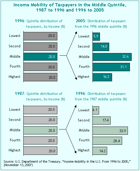
There is a great deal of short-term economic mobility among individuals in the middle income bracket.
A 2007 study by the U.S. Treasury Department found that about half of all taxpayers are in a different income quintile from the one they had been in a decade earlier. It also found that the highest levels of churn occur in the middle income brackets.The chart below illustrates, for two consecutive nine-year periods,where taxpayers who were in the middle income quintile at one point in time wound up nine years later. It shows that, in each time period, roughly two-thirds of the middle quintile taxpayers were in a different quintile after nine years. (It should be noted that the skew toward upward mobility reflected in this chart is due in part to a life cycle effect; at least through late middle age, adults tend to earn more as they age). The chart below offers one explanation for the Pew survey finding that individuals with widely varying incomes identify themselves as being in the middle class. Unlike groups of people, individuals and families experience a good deal of variability from one year to the next in their annual incomes; these variances, however, do not necessarily cause them to change their affiliation with a socioeconomic class.