This chapter uses trend data from the U.S. Census Bureau to analyze changes during the modern era in the incomes of Americans at all levels of the economic spectrum. In the half century following World War II, American families could always count on rising prosperity. Each decade ended with family incomes higher than what they were at the start. That is no longer the case. Years of slow growth punctuated by two recessions left American families with lesser incomes and less wealth in 2010 than in 2000.
This “lost decade”15 is unique in the modern era. It is the only decade in which real incomes fell for all families combined as well as for families in every economic stratum examined. The mean income of families overall decreased at an average annual rate of 0.6% in the “lost decade” (after adjusting for inflation).16 The mean income of families in the lowest income quintile fell at a rate of 1.7% annually, and the income of families in the top 5% decreased at a rate of 1.1% annually. The decline was less steep for families in the middle. For all families, the “lost decade” did more than merely fail to deliver gains; it also erased some of the gains from the previous decade.
Based on income growth, the 1950s and the 1960s were the most beneficial decades for American families in post-WWII times. The mean income for families overall increased at an average annual rate of 2.9% from 1950 to 1960. Growth was widespread across the economic spectrum. The mean income of families in the lowest income quintile increased at an annual rate of 3.7%, and the mean income of families in the top 5% increased at an annual rate of 2.2%. Incomes of other families increased at rates in between.
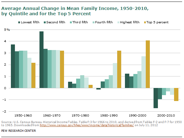
Income growth accelerated in the 1960s, ranging from an annual rate of 4.9% for families in the lowest income quintile to 3.2% for the top 5% of families. Two recessions each in the 1970s and the 1980s slowed the growth in family income but did not bring it to a halt. For all families combined, mean income increased at an annual rate of 0.9% in the 1970s and 1.4% in the 1980s. The one exception to general growth was in the 1980s, with families in the lowest income quintile experiencing a drop in their income at an average annual rate of 0.1%.
The 1990s began with a recession but then delivered the longest economic expansion in modern U.S. economic history. Thus, income growth sped up again for families in all strata to an overall average annual pace of 1.9%. However, the income trends before and after 1980 had one significant difference: Unlike previous decades, income growth in the 1980s and 1990s favored the higher income brackets, and economic inequality in the U.S. rose as a consequence.
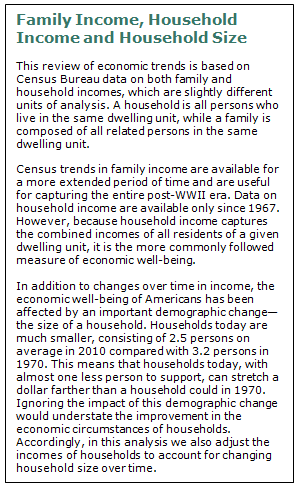
Changes in Household Income
More recent trends in household income echo the decadal changes discussed above. Riding the roller coaster of economic peaks and troughs, median household income has generally trended up since 1970.17 However, the Great Recession had a severe impact on incomes of American households. The median household income in 2010 was no higher than its level in 1997, 13 years earlier. Absent a rapid acceleration in economic growth, it might be several years before household incomes return to the peaks they experienced at the turn of the century.
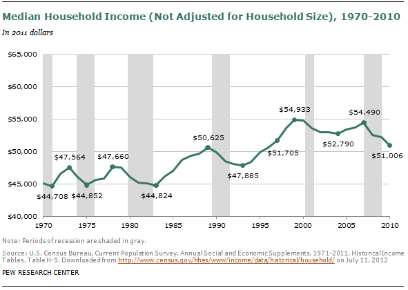
As reported by the Census Bureau, median household income rose modestly from $45,147 in 1970 to $46,025 in 1980. 18 Incomes fell with the twin recessions in the early 1980s but increased sharply later in the decade, with the median level reaching $49,951 by 1990. The 1990s were also a period of economic growth overall and household incomes increased further to $54,842 by 2000. Ten years later, in 2010, the median income had fallen 7%, to $51,006. That was less than the median household income in 1997—$51,705. Over the course of the 40-year period from 1970 to 2010, household incomes at the middle increased by 13%.
Income data reported by the Census Bureau do not account for the changing size of the American household. The typical household in 1970 consisted of 3.2 persons, but the typical household in 2010 had only 2.5 persons, or 20% less. Because a smaller household can do more with a given dollar, the impact of this demographic change should be accounted for when assessing changes in the economic well-being of households.
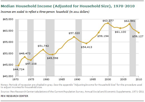
In simple terms, adjusting for household size means crediting income to households that are of below-average size (because their dollars go farther) and debiting income from households that are of above-average size (because their dollars do not go as far). The amount of income to credit or debit depends on the norm that is assumed for the typical size of a household. In this report, incomes for all households in each year are scaled to a three-person household.19 This adjustment has minimal impact on incomes in the early 1970s, when the average household consisted of three persons, but it notably raises incomes in later years.
The median household income in the U.S. when adjusted for the drop in household size increased from $44,845 in 1970 to $59,127 in 2010. That is an increase of 32%, substantially greater than the increase of 13% prior to an adjustment for household size. The effect of adjusting for household size is most pronounced in the 1970s, a decade in which average household size fell from 3.2 to 2.7. As a result, household incomes in this decade are estimated to have increased by 12.2% instead of a mere 1.9% without adjusting for household size.
Household size from 2000 to 2010 was virtually unchanged, inching down from 2.6 to 2.5. Thus, adjusting or not adjusting for household size has virtually no impact on income trends in the “lost decade.” Prior to adjustment, median household income in this decade fell by 7.0%. After the adjustment for household size, the drop in household income is 6.6%. The adjusted median household income in 2010—$59,127—is also no higher than its level 13 years earlier in 1997—$59,194.
The “lost decade” acquires one other unique characteristic after incomes are adjusted for household size—it is the only 10-year period since 1970 in which median household income at the end of the period has been less than at the start of the period.20
Middle-Income Demography, 1971-2011
Trends in median household income are a good indicator of overall changes in prosperity, but they leave many questions unanswered: Is the rise in prosperity shared equally? Are those in the middle faring as well as those above or below the middle? Are income gaps increasing or decreasing? Is the size of the middle class expanding or shrinking? Who is in the middle?
The analysis of these questions reveals that the share of the American adult population that lives in middle-income households has decreased steadily for the past four decades. This has been accompanied by virtually equal parts movements up and down the income ladder. In other words, there has been both progress and regression in the economic status of American families.
However, progress for some demographic groups has been better than for others, and the regression for some groups has been deeper than for others. The winners include seniors (ages 65 and older), married couples and those with a college degree. The losers include young adults, unmarried men, people who have never married and those without a college degree.21 From 1971 to 2011, there was overall progress, with winners outnumbering losers. However, from 2001 to 2011, there was effectively no change in the status of the population overall, and losers outnumbered winners.
These findings emerge from the Center’s analysis of data from the Census Bureau’s Current Population Survey for 1971 to 2011.22 The specific data analyzed are from the Annual Social and Economic Supplement conducted in March of each year. In this month, respondents are asked to provide household income data for the calendar year prior to the year of the survey. For this reason, income data in this report cover the 1970 to 2010 period and the demographic data cover the 1971 to 2011 period.
Who Is Middle Income?
This section of the report uses data on household income to divide Americans into three income tiers—lower, middle and upper. Results from an alternative approach—allowing the public to describe itself as being lower, middle or upper class—are discussed in another section of the report. The size of the middle, whether based on household incomes in 2010 or based on self-described class in the 2012 survey, turns out to be nearly identical.
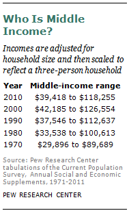
Using income as the criterion, middle-income households are defined as those with a size-adjusted household income that is two-thirds to double the overall median size-adjusted household income. 23 Lower-income households have size-adjusted incomes that are less than two-thirds of the median, and upper-income households have size-adjusted incomes that are more than double the median.
The boundaries of the middle-income tier vary by household size. For three-person households in 2010, the middle-income range is about $39,000 to $118,000. The assignment of a household to the middle-income tier depends on what its income is estimated to be after it is scaled to a three-person household.24 A household with reported income less than $39,000 may fall in the middle-income tier if it has fewer than three members. Conversely, a household earning more than $39,000 may fall out of the middle-income tier if it has more than three members.
Because the median household income has risen over time, the threshold for entering the middle-income tier has also risen over time. From 1970 to 2000, the low end of the middle-income range increased from about $30,000 to $42,000. The threshold fell to $39,000 in 2010 because of the decline in median household income. The precise income ranges used to classify households into the middle-income tier after adjusting for household size are shown in the accompanying table.
How Many Adults Are Middle Income?
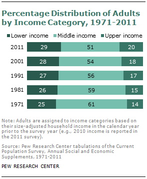
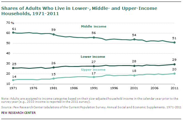
The size of the middle-income tier varies over time because the incomes of individual households, in relation to the overall median, vary over time. In 2011, 50.7% of adults (ages 18 and older) lived in middle-income households.25 In number, that amounted to 117 million adults out of the U.S. household population of 231 million adults.26 The share of the U.S. adult population that lives in middle-income households has diminished over time. In 1971, 60.8% of adults lived in middle-income households, 10 percentage points more than in 2011.
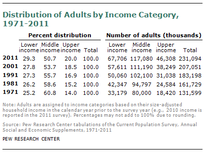
The shrinking, or hollowing out, of the middle-income tier has been accompanied by an increase in the shares of the adult population at the high and low ends of the income distribution—and roughly equal shares have moved up or down. The share of the population in the upper-income tier has risen from 14% in 1971 to 20% in 2011. At the same time, the share in the lower-income tier grew from 25% in 1971 to 29% in 2011. Thus, from 1971 to 2011, the U.S. adult population has become more economically polarized—with relatively more in the top and the bottom tiers, and fewer in the middle.
The hollowing of the middle-income tier has been a steady and virtually uninterrupted process over the past four decades. Starting from 1970, every decade has ended with a smaller share in the middle-income tier and higher shares in the lower- and upper-income tiers. No single decade stands out as having energized the movement of people out of the middle.
Demography of Middle-Income Adults
Because the majority of adults fall into the middle-income tier, the characteristics of the middle bear a strong resemblance to the population overall. The changes in those characteristics also mirror the demographic changes that have swept the U.S. population since 1971. This section summarizes the major findings; the detailed findings are presented in Appendix 1. Among the key observations:
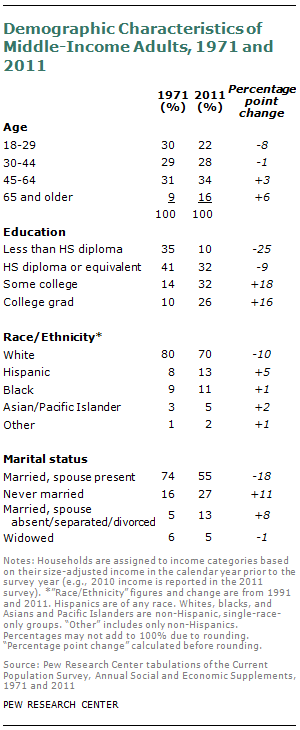
Education: In 2011, only 10% of middle-income adults had not earned a high school diploma or its equivalent and 32% had only a high school diploma. Both shares were down notably from 1971, as is the case with all adults. At the same time, the share of middle-income adults with some college education rose from 14% in 1971 to 32% in 2011, and the share with a bachelor’s degree or more increased from 10% to 26%. These improvements in educational attainment are in line with the trend for the U.S. population.27
Age: The middle-income group of adults aged somewhat faster than the population from 1971 to 2011. The share of middle-income adults 65 and older nearly doubled from 9% in 1971 to 16% in 2011. That was a much sharper increase than in the overall population, where the share of those ages 65 and older rose from 15% in 1971 to 17% in 2011. Conversely, the share of young adults, ages 18 to 29, in the middle-income tier fell more sharply than their share in the population at large from 1971 to 2011—from 30% to 22% in the middle-income tier and from 28% to 22% in the population.
Race and Ethnicity: As with the full adult population, middle-income adults were more racially and ethnically diverse in 2011 than in 1991.28 The share of Hispanics in the middle-income population increased from 8% in 1991 to 13% in 2011. The share of whites fell from 80% in 1991 to 70% in 2011 as the share of blacks and Asians increased.
Marriage: Marriage is less common in the U.S. today than in 1971, and this is reflected in the changing share of middle-income adults who are married with a spouse present. Among middle-income adults, the share fell from 74% in 1971 to 55% in 2011. In the overall adult population, the share of married people with a spouse present fell from 69% in 1971 to 52% in 2011. Meanwhile, the proportion of middle-income adults who have never been married rose from 16% to 27%, mimicking the change in the total adult population.
Winners and Losers
The steady reduction in the share of the U.S. population that is in the middle has affected all major demographic groups. Regardless of education, age, gender, marriage, race and ethnicity, the share in the middle was either reduced or unchanged from 1971 to 2011. The sole exception to this rule is seniors (65 and older) for whom there was a significant decline in the share in the lower-income tier and a notable rise in the share in the middle-income tier from 1971 to 2011.29 However, despite this progress, seniors are still the age group most likely to live in lower-income households.
Even as the shares in the middle have generally decreased, the income status of some demographic groups has improved and the status of some other groups has deteriorated. For the U.S. adult population, the share that is upper income increased from 14.0% in 1971 to 20.0% in 2011, for a gain of six percentage points in income status. However, over the same period, the share that is lower income increased from 25.2% to 29.3%, a loss of four percentage points in income status. Therefore, the net gain for adults overall is two percentage points.
This yardstick—the difference between the changed likelihood of being upper income and the changed likelihood of being lower income—can be used to classify any demographic group as a “winner” or a “loser.” Winners have experienced net advances up the income tiers over time and losers have, on net, slipped down the income tiers.
Age: Those ages 65 and older experienced the biggest gains in income status across demographic groups. Their share in the lower-income tier fell from 53.6% in 1971 to 39.0% in 2011, and their share in the upper-income tier rose from 7.1% to 13.6%. Moreover, their progression up the income tiers was unabated in the “lost decade.” Young adults (ages 18 to 29) had the opposite experience, with the rise in the share of young adults in the lower-income tier exceeding the increase in the share in the upper-income tier. Across age groups, those ages 65 and older remain the least likely to be upper income and the most likely to be lower income. However, while in 1971, they were 32 percentage points more likely to be lower income than young adults, the gap narrowed in 2011 to only six percentage points.30
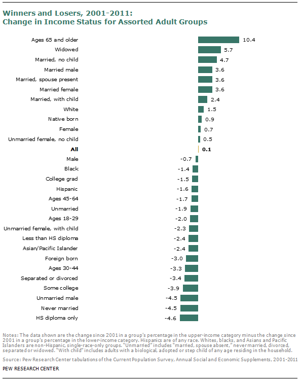
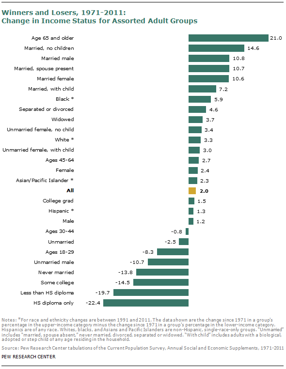
Education: A college education presented the best chance of holding one’s ground. From 2001 to 2011, in the midst of economic stagnation, the income status of those with a bachelor’s degree or more slipped the least. Their share in the upper-income tier edged up from 40.3% to 40.6% even as the share in the lower-income tier increased from 9.7% to 11.5%. College graduates also fared better than those with lesser education from 1971 to 2011. Meanwhile, both from 2001 to 2011 and from 1971 to 2011, those with only a high school diploma fared the worst across all demographic groups included in this analysis.
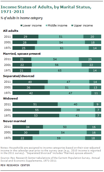
Marriage: When it comes to income status, marriage helps, and it helps couples without children more than it helps other couples.31 This is true for both the long run, from 1971 to 2011, and the short run, from 2001 to 2011. Unmarried men and those who never married have experienced among the greatest losses in income status in either time period. Among those not currently married, the status of those who are widowed has fared the best. Interestingly, the gains for the widowed were experienced in their entirety in the “lost decade.” This could be the result of the aging of women who entered the labor force in ever-increasing numbers in the post-WWII era.32
Race and Ethnicity: Blacks and Hispanics are about twice as likely as whites and Asians to be lower income.33 But among racial and ethnic groups, the income status of blacks improved the most from 1991 to 2011, followed by whites, Asians and Hispanics. The gains for blacks were realized entirely in the 1990s; from 2001 to 2011 they experienced a reversal in their income status. Whites are the only racial or ethnic group that did not experience a loss in income status from 2001 to 2011.
Changes in the Income Status of Demographic Groups
This section presents additional detail on the distribution of demographic groups across income tiers and how the distributions have shifted over time. These shifts underlie the evidence on winners and losers discussed in the previous section.
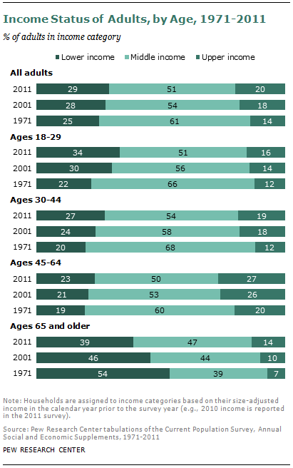
Age: Youth has not been well served in the shuffling of people in the income distribution. Young adults (ages 18 to 29) experienced a notable deterioration in their income status. The share of young adults who are middle income fell from 65.8% in 1971 to 51.0% in 2011. That was largely a result of movement down the income ladder, with the share of young adults in the lower-income tier rising from 21.9% in 1971 to 33.5% in 2011.
In contrast, the share of seniors (65 and older) in the lower-income tier fell sharply and the share in the middle rose notably from 1971 to 2011. In 1971, the majority of seniors (53.6%) were in lower-income households. That share fell to 39.0% in 2011. At the same time, the share of seniors who are middle income rose from 39.3% to 47.4%, a notable exception to the widespread diminution in the size of the middle. The share of seniors in upper-income households also increased, from 7.1% in 1971 to 13.6% in 2011. However, these gains were not sufficient to alter the fact that seniors are the most likely age group to be lower income and the least likely to be upper income.
The experiences of middle-age adults, ages 30 to 44 and 45 to 64, resemble that of the overall population. For both age groups, the shares in the middle-income tier fell with notable movements both up and down the ladder. Among 30- to 44-year-olds, for example, the share in the lower-income tier increased by eight percentage points from 1971 to 2011, and the share in the upper-income tier increased by seven percentage points.34
It is worth noting that the economic status of seniors may be understated based on the income criterion alone. Seniors, the vast majority of whom are retired, may supplement their reported incomes with the drawing down of their accumulated wealth. Since a family’s wealth represents the culmination of savings over its lifetime, seniors typically have more wealth than younger families. In 2010, the median wealth of families whose head of household was ages 65 and older was $219,104. 35 That was much higher than the median wealth of other families—$147,555 for families whose head of household was 45 to 64 years of age; $32,989 for families whose head of household was 30 to 44; and $6,344 for families whose head of household was 29 and younger. This may be one reason why seniors, when asked to describe their status in the survey, are more likely than younger people to call themselves middle class, even though based on adjusted household income they have the lowest share in the middle (see Chapter 2).
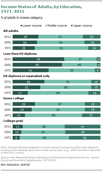
Education: The U.S. economy has increasingly favored skilled workers over the unskilled, and this is reflected in the income status of education groups. Adults with only a high school diploma or a lower level of educational attainment saw their relative income position decline sharply from 1971 to 2011. Among those with less than a high school diploma, the share in the lower-income tier increased from 41.0% in 1971 to 58.9% in 2011. The share in the middle-income tier fell from a majority—52.9% in 1971—to slightly more than one-third—36.8% in 2011.
Adults with only a high school diploma did not fare any better—the share in lower-income households rose from 17.1% in 1971 to 36.1% in 2011, and the share in middle-income households fell from 69.2% to 53.6%. The slide down the income tiers is also the defining experience for those with some college education but not a bachelor’s degree. The share of those adults in lower-income households increased from 14.1% in 1971 to 25.6% in 2011.
The only education group whose representation in the upper-income tier increased is the group with a bachelor’s degree or higher level of attainment. Among college graduates, the share in the upper-income tier rose from 35.7% in 1971 to 40.6% in 2011. That improvement in economic status largely accounted for the shrinking share of college graduates who were middle income, from 56.2% in 1971 to 47.9% in 2011.
Americans have clearly taken a liking to the increased value of a college education. The share of adults with a college education has increased from 10.7% in 1971 to 27.8% in 2011. Over the same time, the share with less than a high school diploma has fallen from 39.7% to 13.3%.36 The improvement in the education profile of Americans has sustained the overall advance in income status even as all but one education group has experienced a decline.
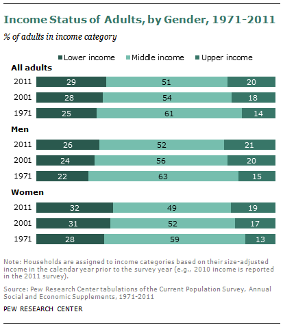
Gender: Men are more likely than women to live in upper- or middle-income households. In 2011, 52.2% of men were in middle-income households and 21.5% were in upper-income households. In contrast, 49.3% of women were in middle-income households and 18.7% were in upper-income households. From 1971 to 2011, men and women experienced similar declines in the shares that are middle income; the shrinking was roughly equal parts up and down the ladder for both sexes.
Marriage: Being married with a spouse present
has clear economic benefits—these adults are the least likely to live in lower-income households and the most likely to be in the middle- or upper-income tier. The income status of married adults with a spouse present also improved the most from 1971 to 2011. The share of this group in the middle-income tier fell from 65.0% in 1971 to 53.6% in 2011. Virtually all of the movement was into the upper-income bracket, with that share rising from 14.2% to 25.2%.
At the other end of the spectrum, the income status of those who have never married deteriorated sharply. Among the never married, 59.3% were in the middle-income tier in 1971, and this share fell to 49.5% in 2011. Over the same period, the share in the lower-income tier rose from 22.5% to 34.3%.
People who are widowed and those who are separated or divorced are even more likely than the never married to live in lower-income households. For example, slim majorities of the widowed lived in lower-income households in each year examined. The income status of individuals who were widowed, separated or divorced did improve slightly over time, with the shares in upper-income households edging up from 1971 to 2011.
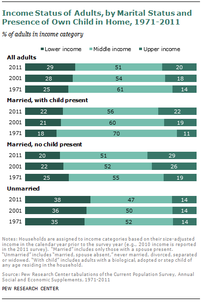
Marriage and Children: Among those who are married with a spouse present, the couples without children present in their homes have relatively better income status. In 2011, 28.6% of married couples with no children at home were in the upper-income tier, compared with 22.2% of married couples with children at home. Both groups experienced improved income status over time. In 1971, only 19.2% of married couples with no children at home and 11.4% of married couples with children at home were in the upper-income tier. Thus, for either group, the shrinking of the middle income was accompanied by a rise in the share in the upper tier. But for married couples with children in the home, there was also an uptick of four percentage points in the share that are lower income.
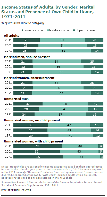
Marriage, Gender and Children: Among unmarried women, including those who are widowed, divorced or separated, the majority of those with children at home live in lower-income households. This has not changed over time, the share being 55.1% in 1971 and 54.2% in 2011. Only 6% of these adults are in the upper-income tier, and the income status of this group most resembles that of adults with less than a high school level of education.
The income status of unmarried women is improved if there are no children at home. However, they do not currently fare as well as unmarried men. In 2011, 32.4% of unmarried men were in the lower-income tier, compared with 38.6% of unmarried women with no children at home. Unmarried men were also slightly more likely to be in the upper-income tier. However, the gap between these two groups is shrinking. From 1971 to 2011, the share of unmarried men in the lower-income tier increased from 23.6% to 32.4%, and the share in the upper-income tier fell from 19.0% to 17.2%. Among unmarried women with no children at home, the share of those in the lower-income tier was unchanged, and the share in the upper-income tier rose from 11.7% to 14.7%.
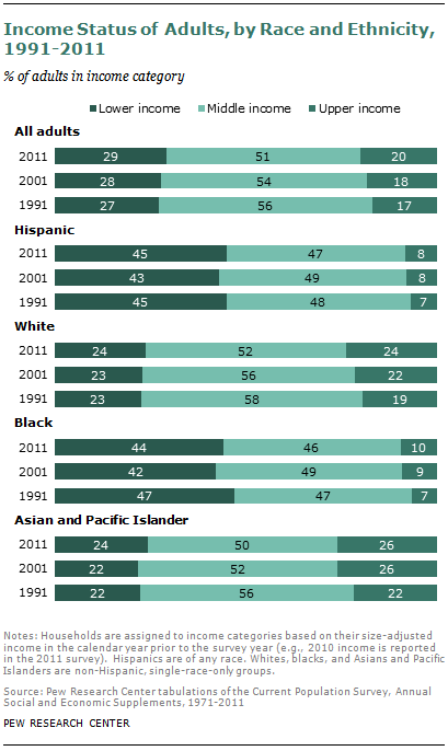
Race and Ethnicity: Because of changes to the classification of racial groups, consistent data on the income status of these groups are available only from 1991 to 2011. Blacks and Hispanics are the most likely to live in lower-income households, and whites and Asians are the most likely to be in the middle- or upper-income tier. However, from 1991 to 2011, blacks were the only racial or ethnic group to experience a reduction in the share of lower-income households, with their share falling from 46.9% to 44.0%. Like whites and Asians, the share of blacks in the upper-income tier rose in these two decades, from 6.5% in 1991 to 9.6% in 2011. The income status of Hispanics was virtually frozen from 1991 to 2011 with only a modest increase in the share in the upper-income tier from 7.0% in 1991 to 8.4% in 2011.37
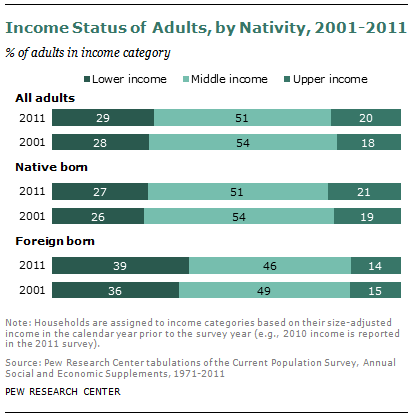
Nativity: Data by nativity are presented for only the 2001 to 2011 period because immigrant status was not recorded in the source data until 1994. Foreign-born adults are much more likely than native-born adults to live in lower-income households—39.3% versus 27.5% in 2011. Conversely, native-born adults are much more likely than foreign-born adults to be in upper- income households—21.1% versus 14.5% in 2011. The changes in income status from 2001 to 2011 were modest, but they favored the native born. Among the native born, the share in upper-income households increased two percentage points, offsetting the slight increase in the share of lower-income households. Meanwhile, among the foreign-born, the share in lower-income households increased three percentage points and there was no change in the share of those in the upper-income tier.


